![[LOGO]](xirah2.png)
Some things I've done so far, focusing on visualization and web development.
Design and graphical arts
I've been painting and drawing since I was a child. Music and literature are also important parts of my life. I can apply creativity in graphical works or to technical solutions, as this summary will try to show.
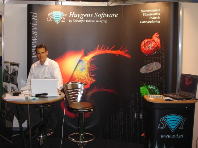
I worked for a couple of years in an advertising company doing some graphical work. This experience was valued later in all companies I worked for, when we needed to create product logos, merchandising, conference booths, and web design. This is some of my previous graphical work:
![]() Logo for HRM
Logo for HRM
Some of my friends are artists, and I have even collaborated with one of them in an installation.
Physics
My PhD thesis is written in Spanish, but this article is a good summary in English.
I was studying a strange effect observed in some superconducting materials.
Superconductors conduct electricity without losses, but they unfortunately work only in very cold temperatures. When a high magnetic field is applied, the materials abruptly lose their superconducting properties earlier than expected, and it was not clear why this happened. There were all kind of theoretical models being published trying to justify it by appealing to really complex physical events.
In my research, I measured this effect on several samples, and after inspecting the data and comparing it to all available models at the time, I created a new model to illustrate how everything could be very well explained just by the material getting warm:
Once one tiny part of the material gets a little hotter, it looses its superconducting properties. By doing so, it becomes resistive, and the flowing electricity starts creating a lot of heat, like a tiny light bulb. This heat propagates inside the material and makes other parts of it hotter, faster than the surrounding cooling can get rid of it, causing an avalanche that quickly destroys the superconductivity everywhere.
The beauty of it was that the idea was very simple, the physical model very easy to explain even to high school students, and it fitted the experimental data perfectly.
Experimental physicist are not mathematicians, we like to see images and not just the equations, so I had to illustrate all this with computed data, graphical simulations, and experiment comparisons. The following images are some examples of that.
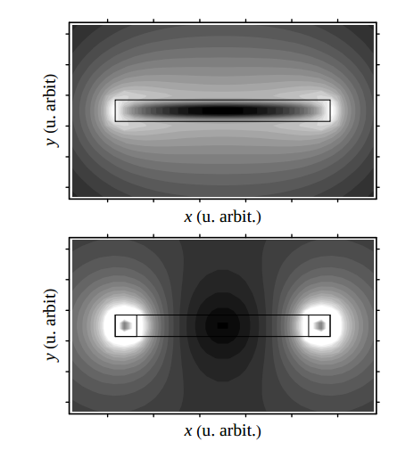
Computed magnetic field alternatives created by currents inside the material:
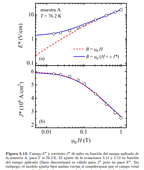
Showing how improving a model increases the fitting with experimental data dramatically:
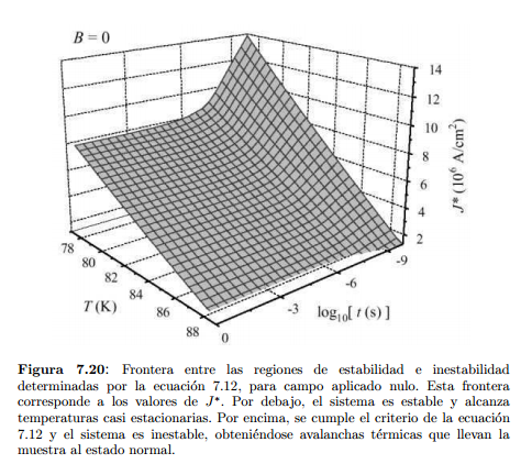
Showing the critical regions of my model, as a function of two variables simultaneously:
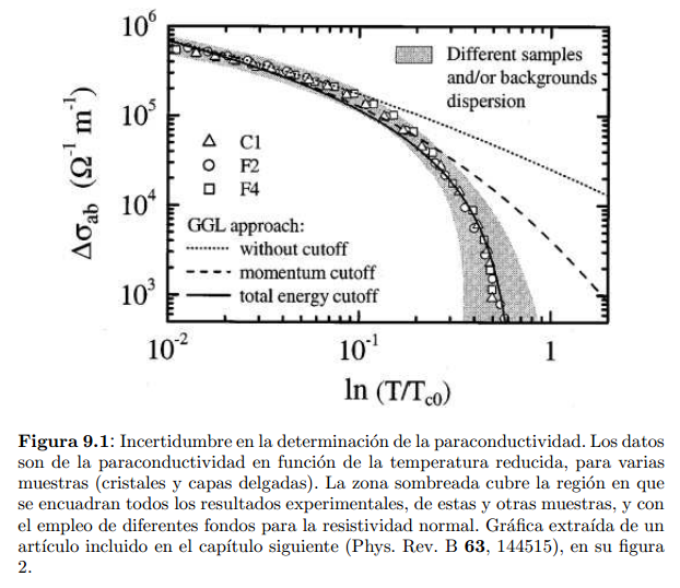
In another part of the thesis, again how improving a theoretical model makes the predictions fit the experimental data much better:
During this time I had my first experience with on-line report generation: I programmed my devices to generate web reports and graphs, and to send me SMS automatically when something was wrong, so that I could leave the machines measuring by night and during the weekend.
Image processing
I entered Scientific Volume Imaging to participate in a combined European research project, the 3DGenome. It involved creating an on-line image database for the different participants to share their 3D images. Each image was hundreds of MB in size, and in that part I focused mostly on the transmission of data, and on automatically generating previews of the images that could be handled by the web interface.
While at SVI I enjoyed working with biologists a lot. We were doing image restoration software to improve the images acquired by their microscopes, in very low illumination conditions (not to kill the delicate cells).
Microscopes are sophisticated machines that reach the physical limits of optics, and it you want to go beyond that, you need to do image processing. Based on physical descriptions of the microscopes, we could create distortion models and revert them, to improve the images. This process, called deconvolution, is computationally intensive.
I wrote a whole wiki for my previous company, to explain to our customers about the problems they had in their machines. This is an example: http://www.svi.nl/SphericalAberration
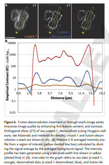
In the following image, you can see a slice of the original image at the left, and how it gets improved to the right when we perfectionate our restoration algorithms:
The idea in this particular microscope was to align multiple 3D images obtained in different rotations of the cell, and feed them all together in the restoration algorithms. The more data we had, the better the averaging and the reconstruction. But alignment of the data was a difficult task on its own, and we had to show that we could do it correctly:
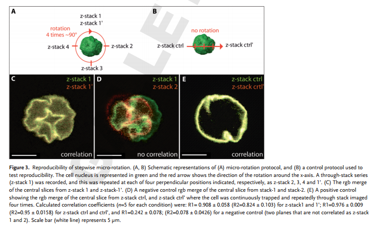
That was a nice work together with Institute Pasteur in Paris. The published article can be downloaded only with a subscription, but you can download a PDF preview from here.
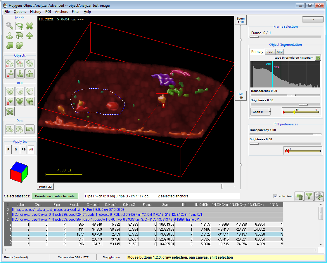
We were also doing other kind of data analysis, studying objects inside the recorded images. We made interactive tools to explore these objects, and report all kind of statistics about them: http://www.svi.nl/ObjectAnalyzer
Trying to bring image restoration to the web, I participated in creating a web interface to control centralized computation resources. I created the first interactive tools inside the Huygens Remote Manager. That was my first experience with JavaScript to improve the user experience.
Information Technology
Since 2010 I am working away from science, but still doing some work related with data analysis. My main project is Azavista, focused on the hotel industry. There I work as a back-end and front-end developer.
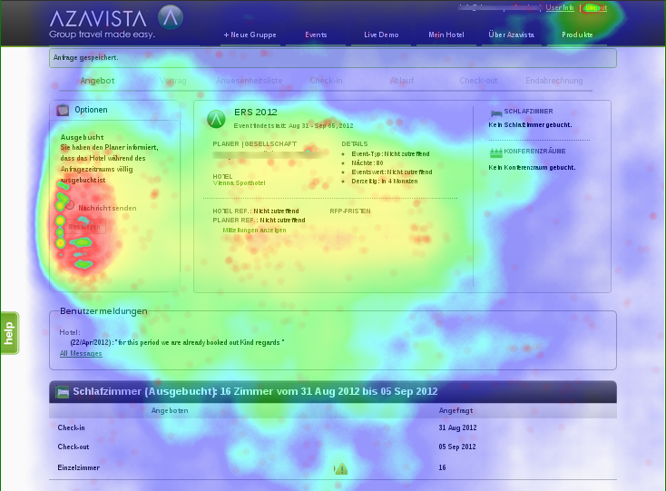
Apart from using Google Analytics and Piwik to analyze the traffic on our own sites, I implemented our own tool for user interaction tracking, that allows us to explore heatmaps of user activity.
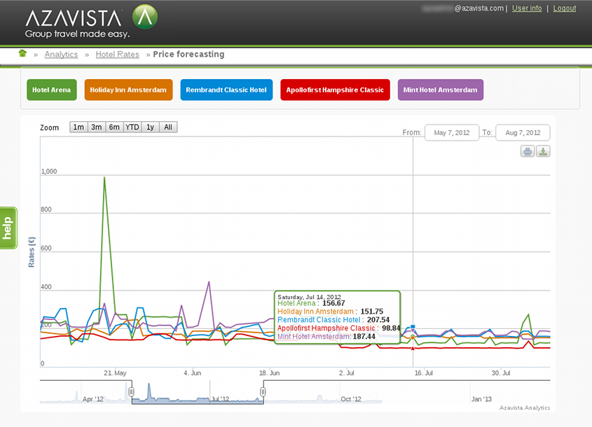
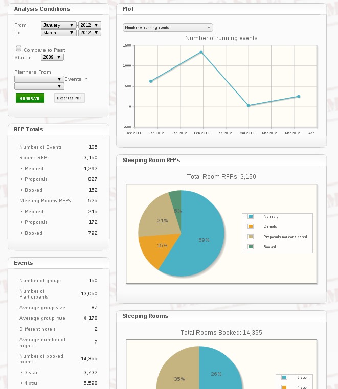
We also create interactive analysis tools to our customers. The following is a screen capture of some prototype:
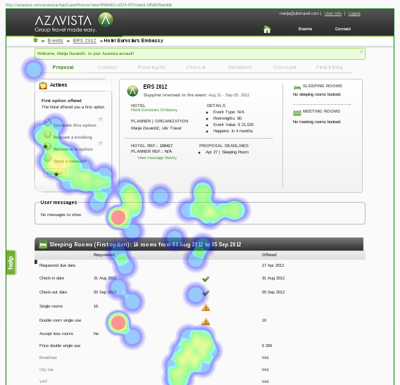
This is a link to an interactive report generation tool we have for national organizations. This is also a prototype I made, and the data is completely random, so you can play with it:
Presentations
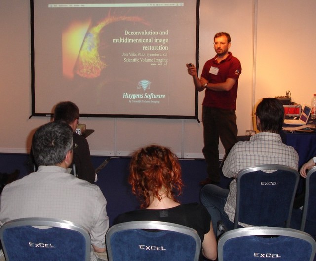
I have a lot of experience giving presentations, that are very much appreciated.

“After the training that Jose gave here at the NIH, we were very impressed by his presentations. He really managed to get us into what image restoration can do for our data and to explain all the complicated algorithms without showing one mathematical equation. This was absolutely brilliant. The workshop was very informative, great to follow and understand, and very enjoyable. I think it makes a huge difference and a big service to have such a competent, dedicated and talented person. Amazingly he also had no signs of jetlag and held through two full days of presentations and questions.”
Daniela Malide, staff scientist, National Institutes of Health, USA
(Recommendation on my LinkedIn profile)
More references
You can find more details and recommendations at my LinkedIn profile.
Some more papers summarizing my previous work, at my personal page.